




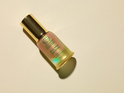
School House, the New York-based creative agency known for its work with beauty brands, partnered with Tata Harper to elevate its Supernaturals collection with packaging that translates Tata Harper’s brand purpose into an unforgettable new look for the 100% natural skincare line.
School House based the new campaign on nature, which inspired the look and feel of the packaging.
Once unboxed, the yellow coloration, a play on the iconic Tata Harper green silhouette, reveals a tint of iridescent purple as the bottle hits the light, representing the most potent types of plants, whose purple pigments announce the power and ingredients they contain.
Inspired by the original line from the brand, the packaging features fully custom detailing from bottle to outer shell while simultaneously celebrating the brand’s foundational commitment to sustainability with completely recycled materials and a sustainable process.
Tata Harper’s Supernaturals line exists at the nexus of natural product and luxury. In considering the repackaging, School House began with a focus on the unboxing experience. The new package invites consumers to pull the internal secondary box out of its shell, revealing recycled vellum printed with text detailing Supernaturals’ process and ingredients. Exposing the product, snug inside a recycled pulp, to air and light.
Through the subtle expression of the brand and a visual identity exploration, School House aimed to produce an elegant design, with nuanced componentry, that commands attention and tells the story and strategy of what Supernaturals stands for, translated into an unparalleled process of customer interaction and exploration.


