


Out with the old and in with the new. Rich colors of ocean blue, amethyst, and deep onyx are having a moment and taking the forefront in magazine spreads, celebrity homes, and interior designer Instagram feeds. And your favorite paint companies are offering up plenty of options for the bold and daring, and even the weary.
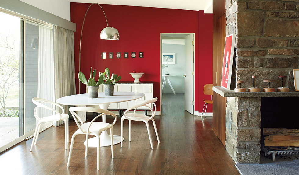
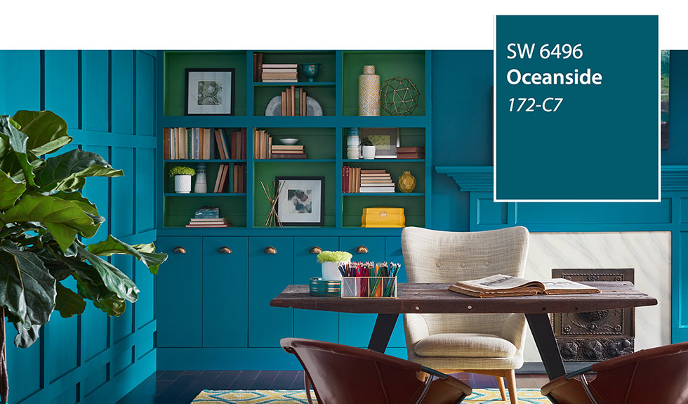
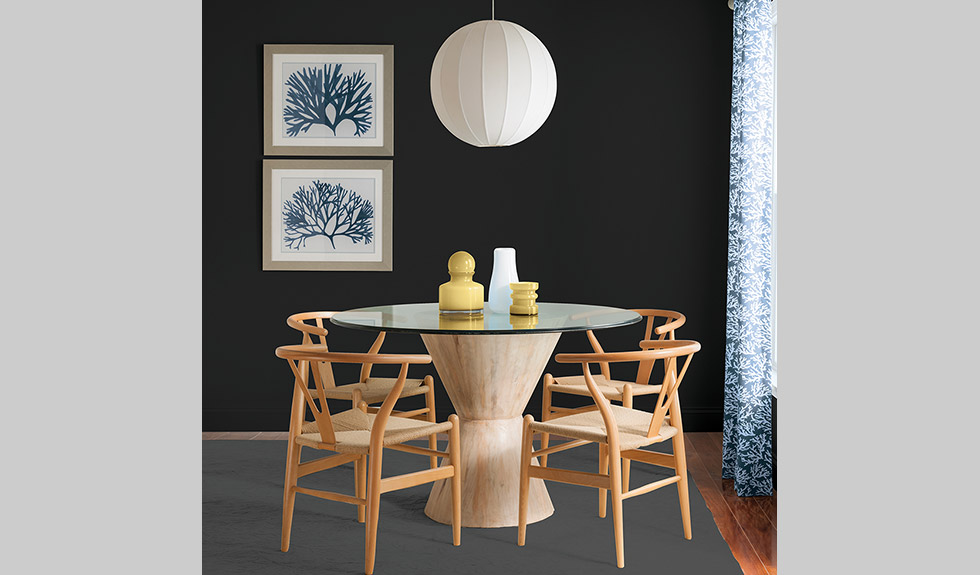
As 2017 came to an end, paint companies were already naming their color of the year for 2018. Sherwin-Williams selected a moody blue called Oceanside; Benjamin Moore chose an intense, bright red called Caliente, along with its new paint line, Century, which hosts colors such as Obsidian, Black Currant, and Amethyst; Glidden Paint named Deep Onyx as its color of the year; and Olympic Paints & Stains went with Black Magic.
Farrow & Hall’s international color consultant Joa Studholme contributed the shift to darker hues with a need to make ones home feel nurturing and tender in an interview with The New York Times.
But some may not be so eager to splash an edgy color on their neutral walls for fear of making the room too dark, too small, and too confining. Here are some ways to stay on trend creating the perfect amount of drama for your home.
Small Spaces
Not everyone can be so daring when it comes to dark paint colors for the interior of their home. And, that’s OK. For those who are more comfortable with warm and earthy tones or the array of neutrals, just the right amount of dark can go a long way.
Donald Kaufman, co-owner of Donald Kaufman Color with wife Taffy Dahl, urges those who are more skeptical of going dark to limit its use. “Limit the color to the inside of cabinets, backs of bookshelves, or a painted floor,” says Kaufman in an interview with The New York Times. “Bold windows often bring the outside in.”
Studholme mentions the usage of a dark hallway to make rooms off the hall seem larger than size.
Definition Without Light
For those a little more ready to jump feet first into the new trend, creating a dramatic room with a dark paint and light trim is the perfect option.
Frances Merrill, founder of Reath Design in Los Angeles, discussed her use of creating more definition to her children’s playroom by using a dark gray to finish the space, in her interview with New York Times writer Michelle Higgins.
“A deep, rich color goes an especially long way in a room without a lot of natural light, as dim rooms look particularly dull in lighter colors,” Merrill said.
And Leatrice Eiseman, the executive director of the Pantone Color Institute, followed up Merrill’s statement by noting that painting the trim a lighter color in a darker room can increase the illusion of space.
Illuminating Variation
When you’re not so weary of bold hues for the New Year, but also not ready to dive deep and paint the whole home in eggplant, choosing an in-between variation can be quite appealing.
Alex Kalita, founder of Common Bond Design in Manhattan, created what she calls the “chair-rail-effect” when painting a client’s stark, white rental unit. “[Painting half of the wall in Farrow & Ball’s Hague Blue] simulates architectural variation in an otherwise uniform space,” says Kalita in her interview with Higgins.
Kalita also mentioned balancing out the room by keeping furniture neutral or camouflaging bulkier pieces into the color of the wall.
Regardless of opinion on the New Year’s highly-anticipated interior design trend, there are multiple ways to approach the darkness.
Via: The New York Times
Photo Gallery


Add Comment